Abacus Wealth
Aiming to be a model for the type of world we’d like to live in: prosperous, diverse, sustainable, inclusive, and kind.

“Wealth has exchanged into hands that expect a friendlier and
more approachable management system. Could you help us set
up something better for our users?”
more approachable management system. Could you help us set
up something better for our users?”
Abacus Wealth simplifies peoples’ lives with a plan that connects their money to what matters most to them. I was tasked with bringing their online presence up to date, along with the help from super devs Angie Webb, and her team members Mark and Barbara.
They had already started working with the updated identity, so the challenge here was to extend that onto the screen, and give them a few new ideas to build up their new brand story. We kept the design clean and simple, easily allowing them to move into the future with confidence.
ART DIRECTION
CONCEPTING
USER INTERFACE
VISUAL DESIGN
Bringing the new brand online
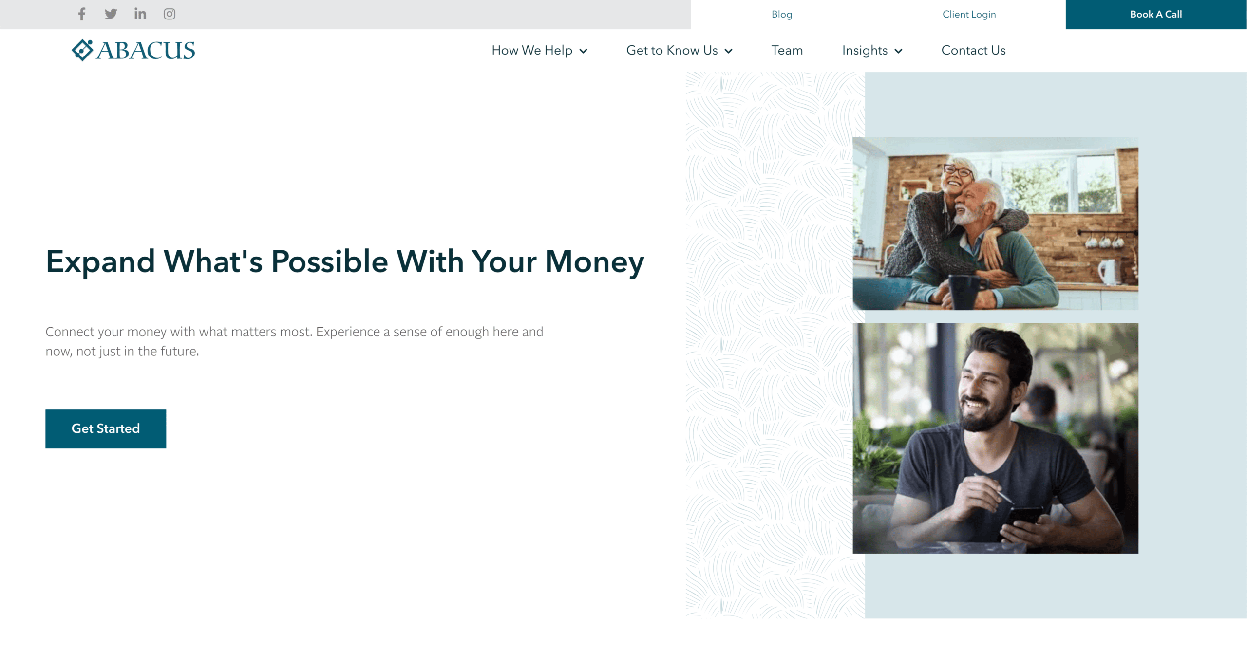
As Abacus Wealth was being rebranded, it was necessary to create a modern medium, combining micro-interactions. These highlighted the refined content and high-quality visuals, which helped the overall experience be broken down to a balance between order and chaos.
Offering a professional, and modern style
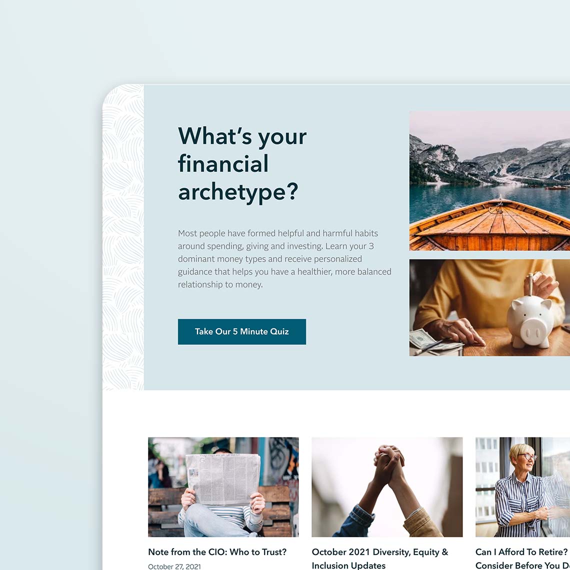
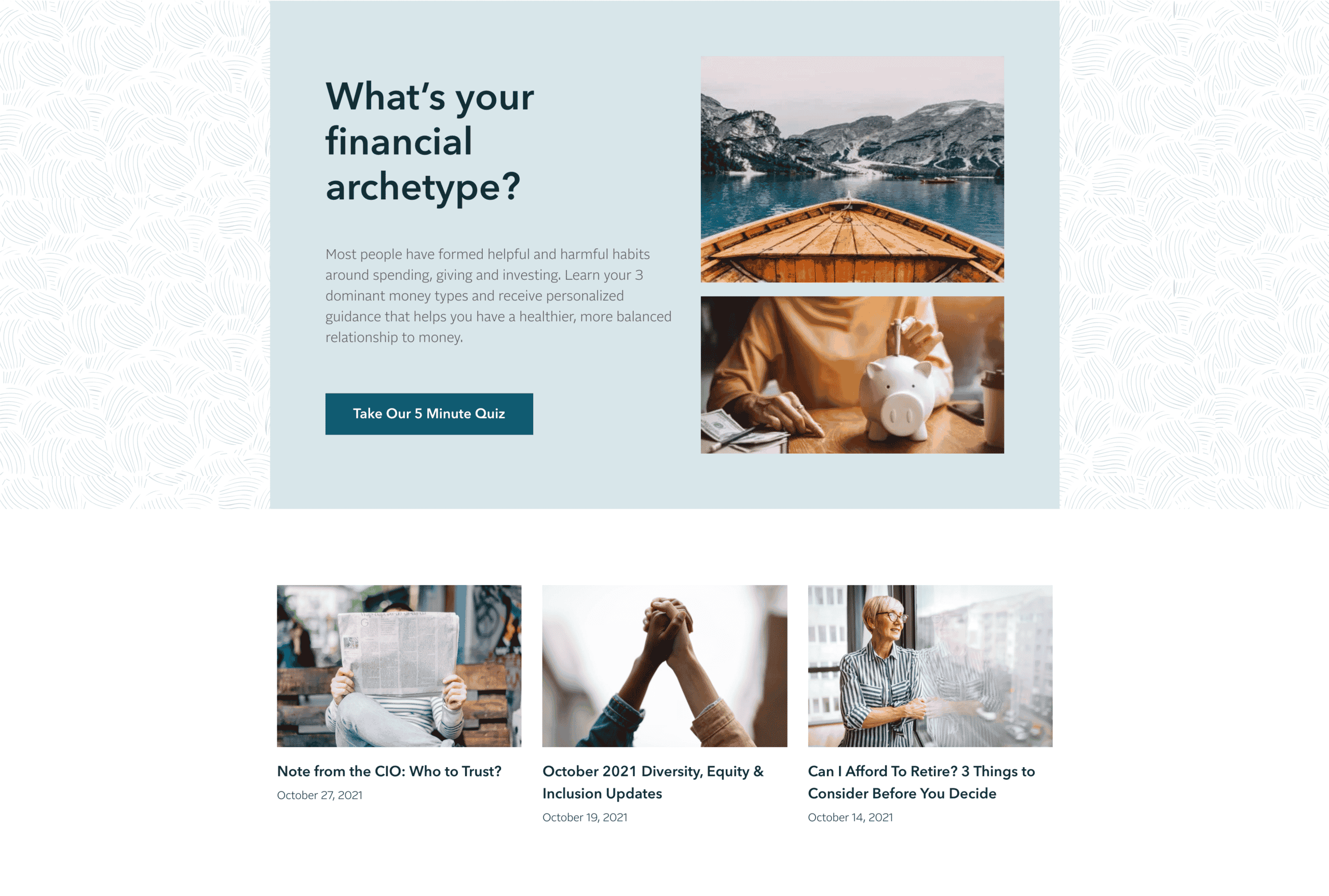
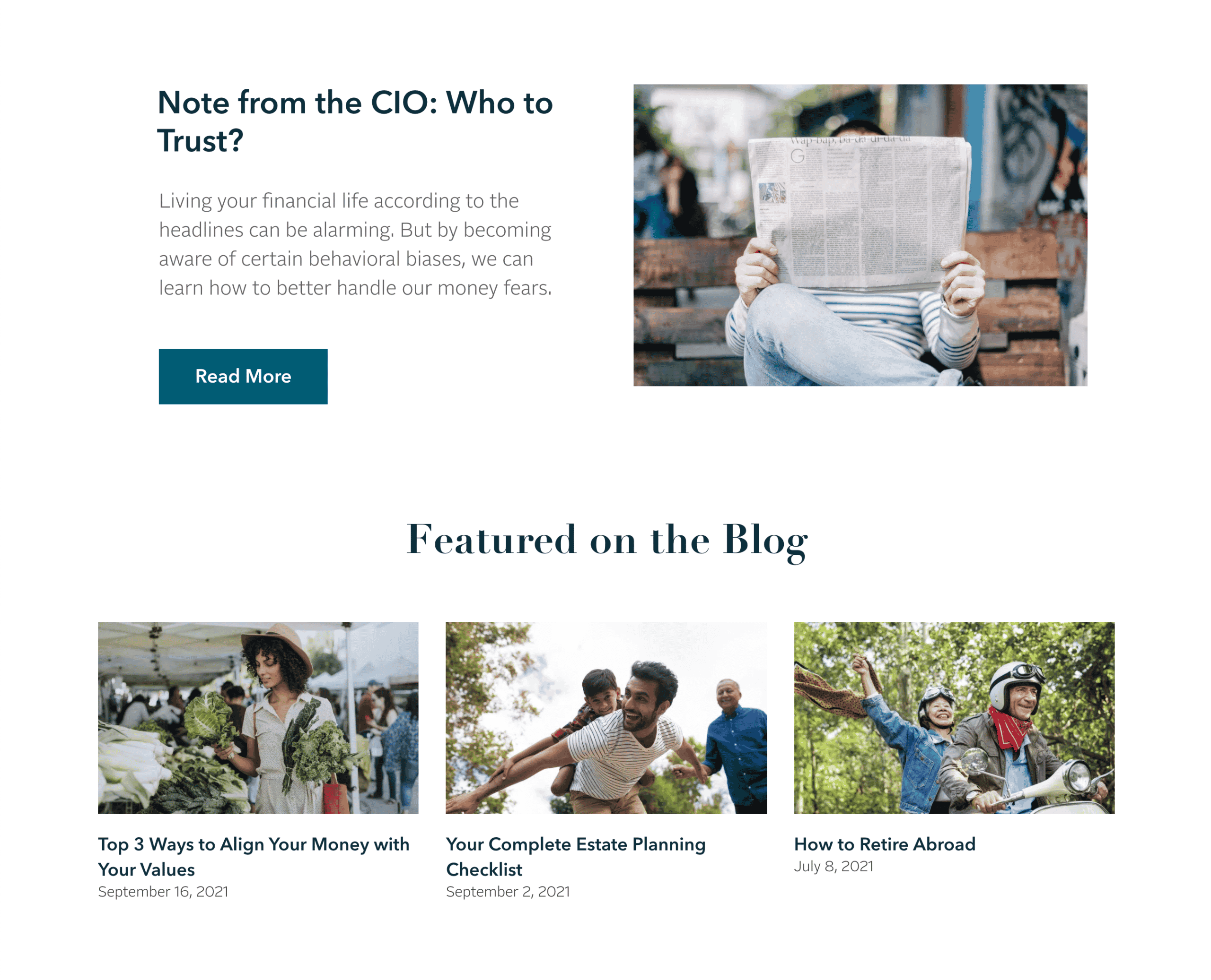
Abacus Wealth deals with a very technical subject. Rather than offering a simple highlighting of photography, we wanted to play on an original and simplified representation of the controlled chaos. Thus, the artistic direction offers a succession of square shapes, which are all pretexts to add photography, movement, and symbolize the controlling of the chaotic textures.
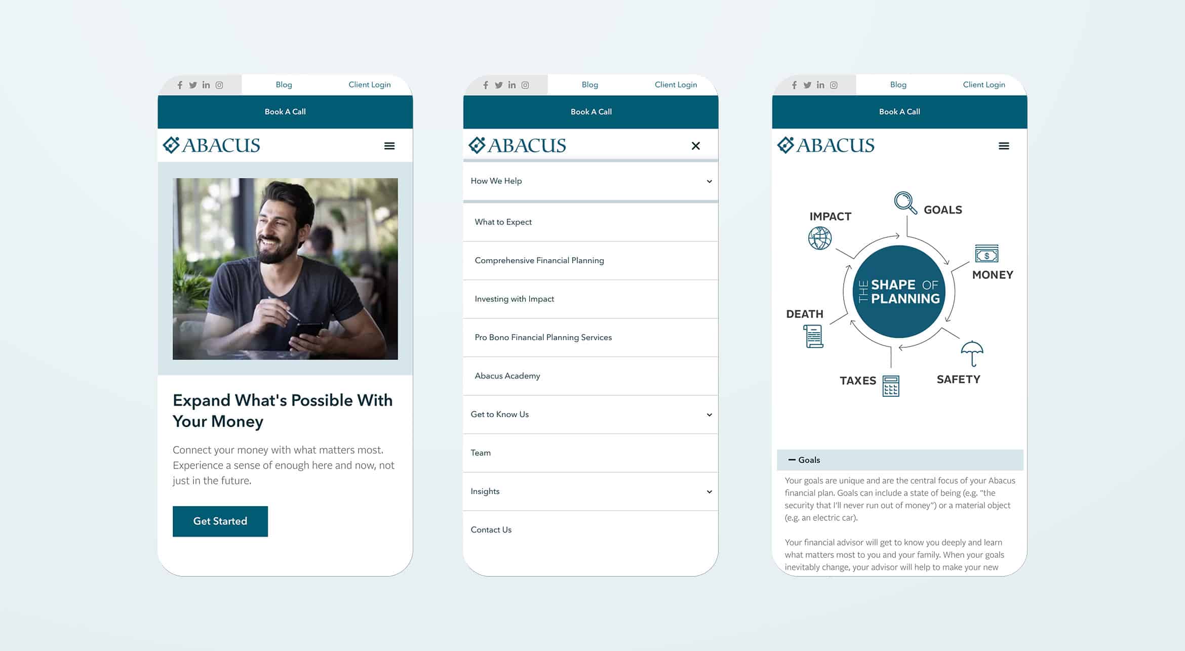
Responsive
variation
Our ergonomic, creative and editorial approach is of course perfect for all devices, tablets or smartphones.
