
the printed word
“We need someone to breath life into the design and layout of our publication.”
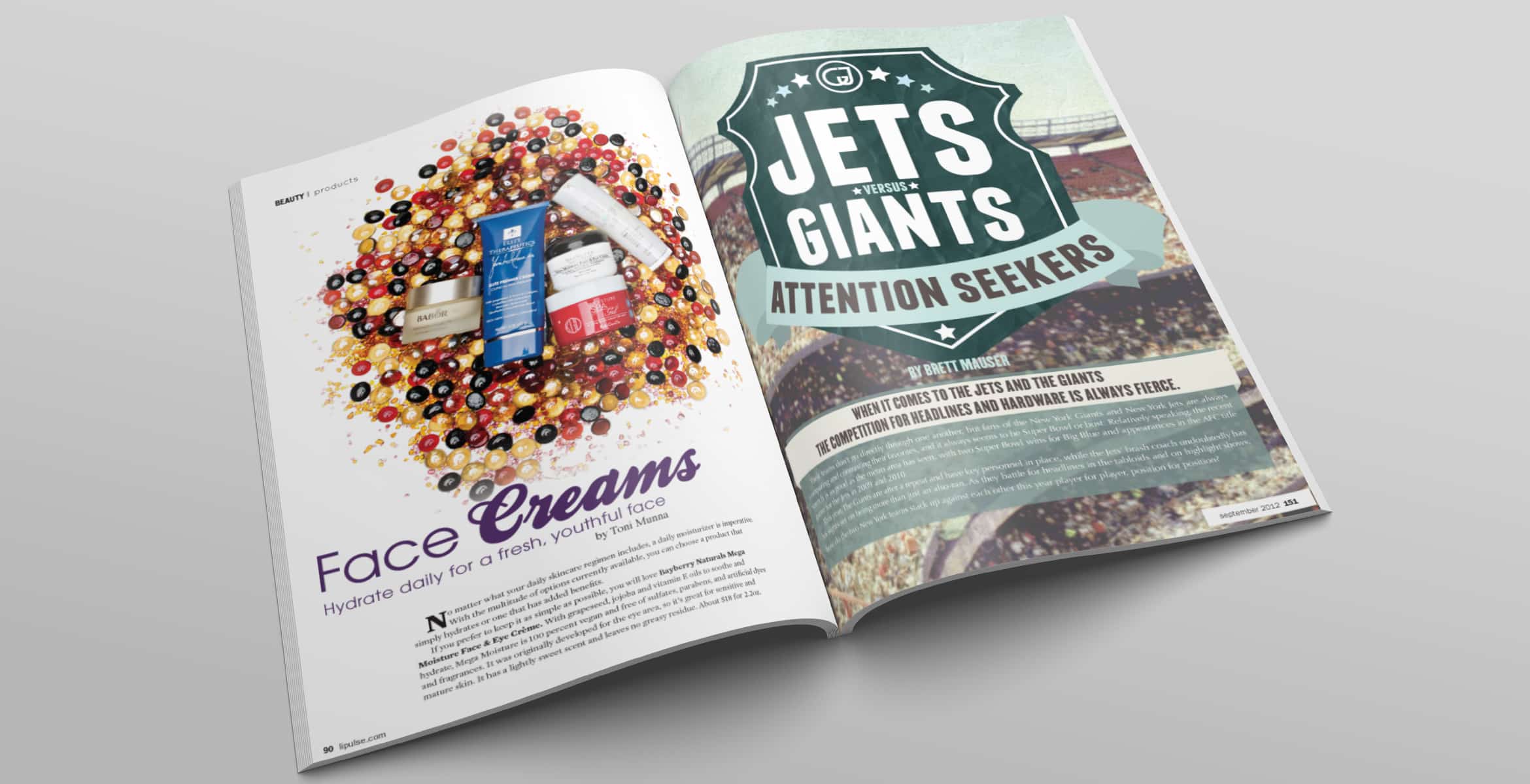
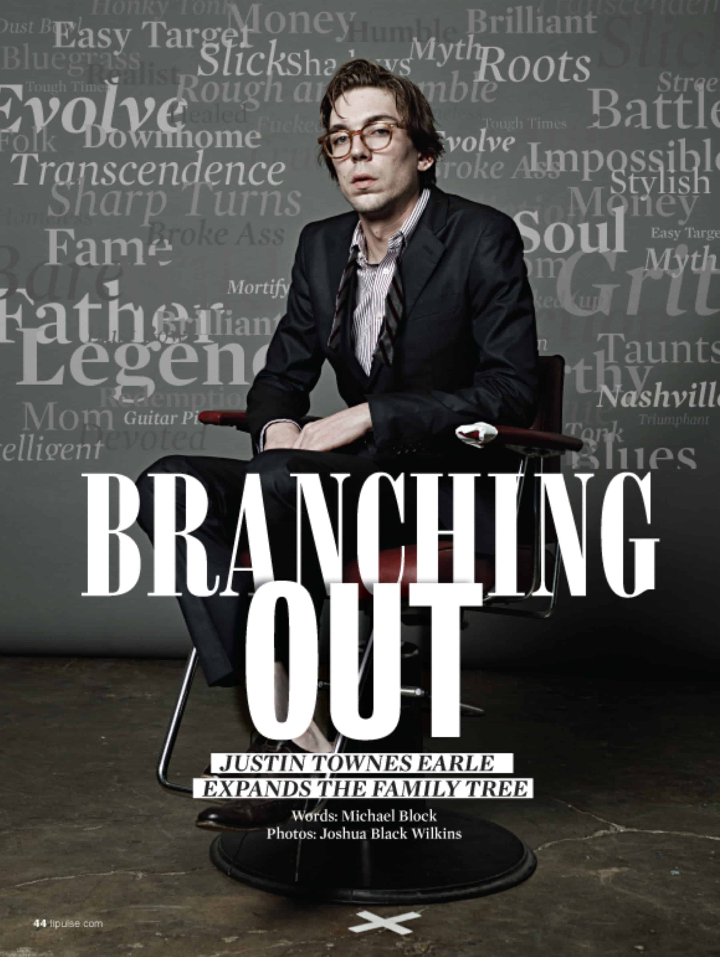
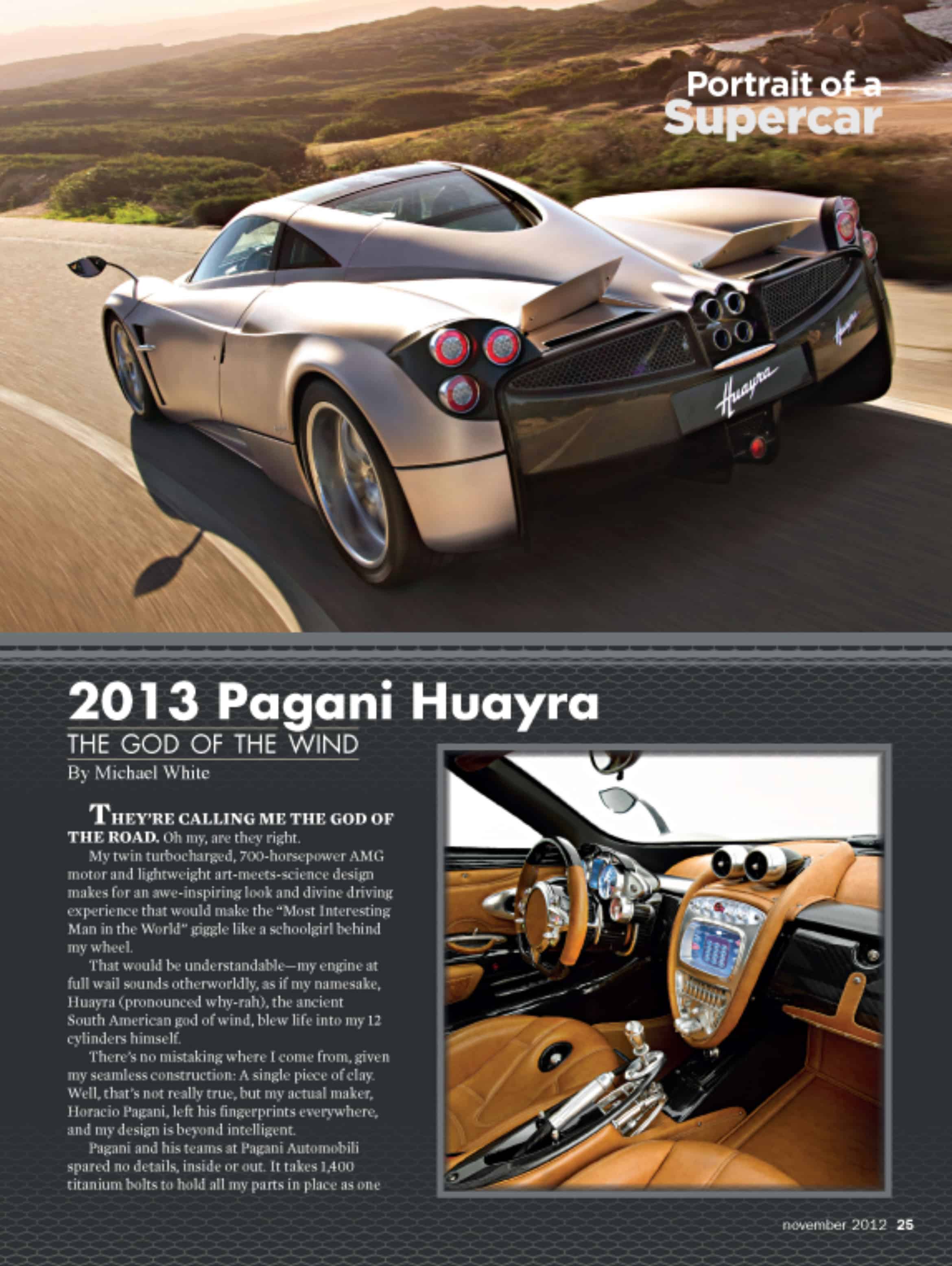
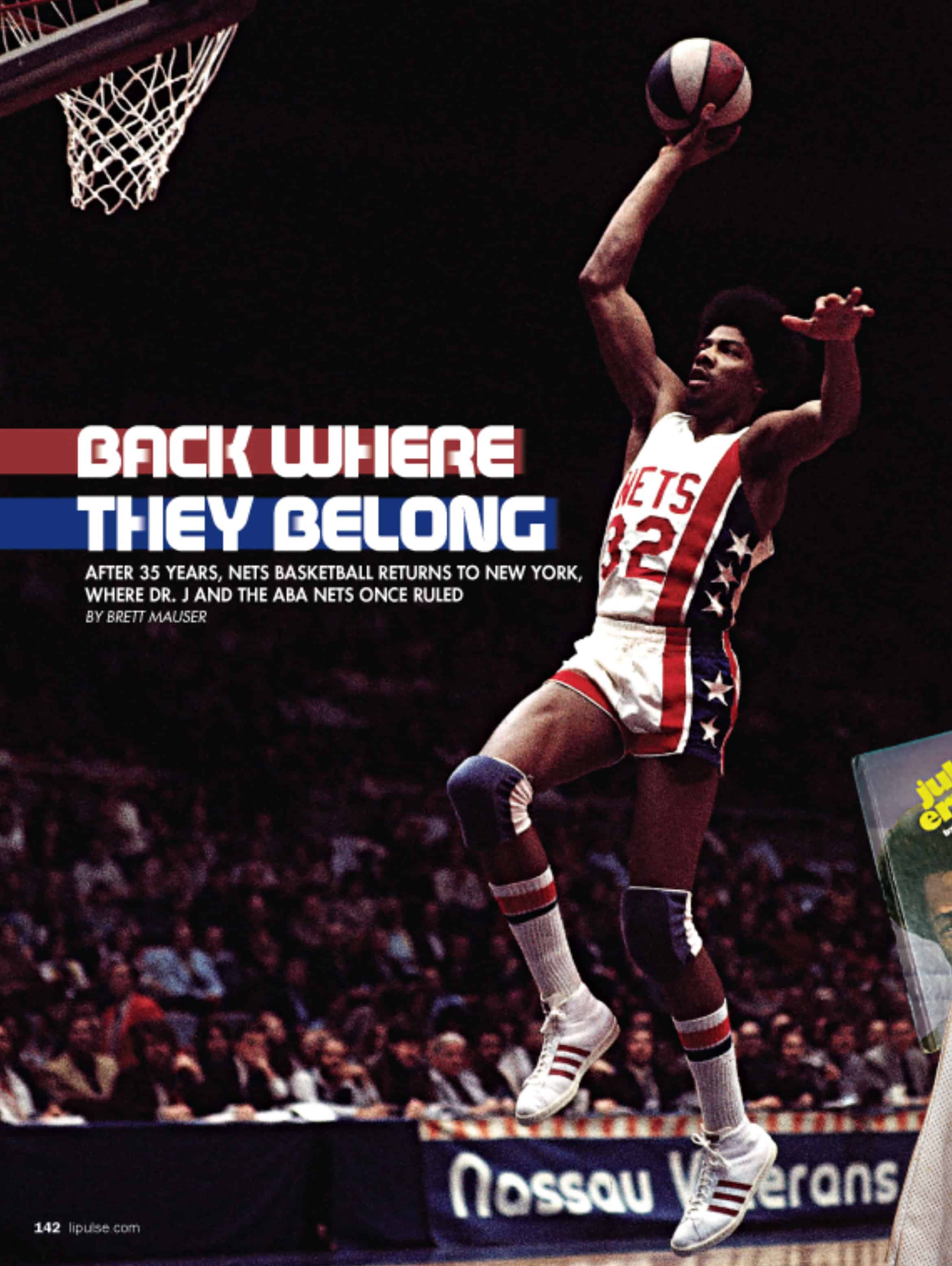
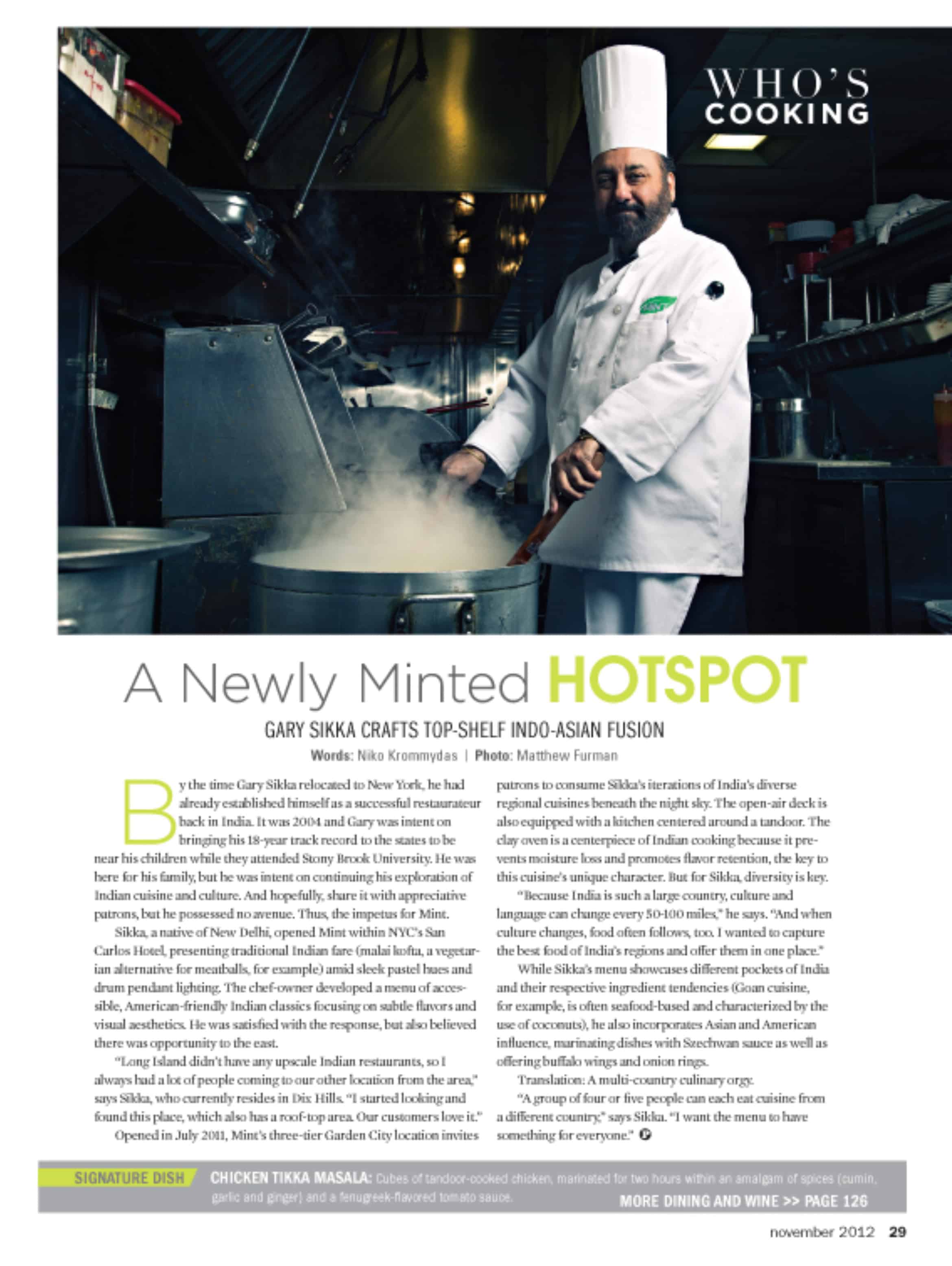
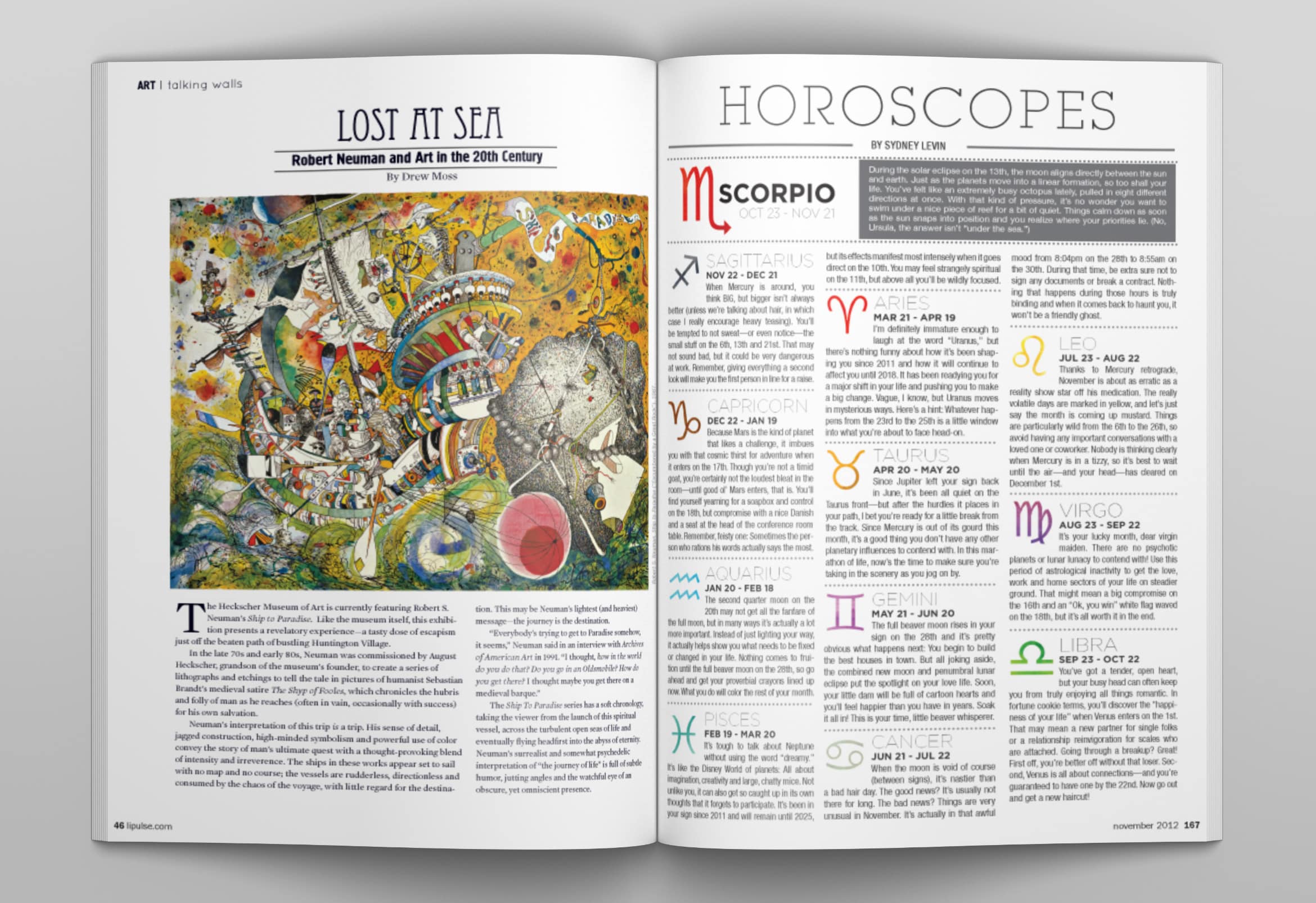
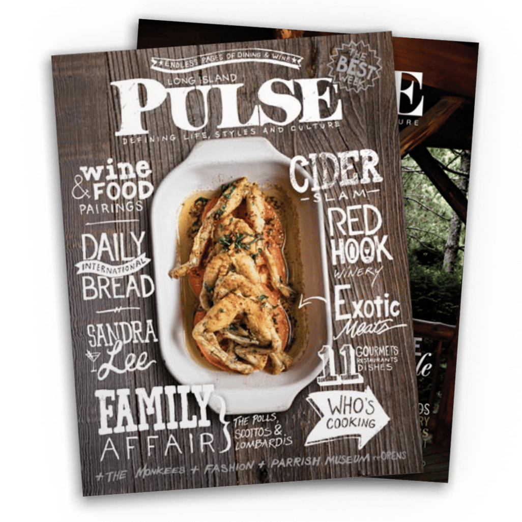
Long Island Pulse Magazine was in dyer need of a refresh and millennialization of their publication, in order to draw a younger and more diverse audience. They needed a fresh perspective that would be able to push perspectives and change opinions on how the design of the publication would be approached.

new approaches
“Eric did the stuff no one else wanted to do. While also increasing the value of the visuals and content for our new and younger audiences.”
While working with LI Pulse Magazine I expanded and differentiated their title systems, while also upgrading their front and back of the publication information and iconography to provide an easier and more simplified experience. While upgrading all the small details of the magazine, I was also part of the art direction of the cover imagery and typography, as well as the primary stories of the three products I was a part of.

