Tings & Associates
Improved usability, accessibility, and pleasure in the design & development of Tings' online UX & UI.

old is out
“We need to translate our brand into something more creative and interesting.”
People said the old Tings & Associates logo looked too much a like lifestyle brand and less like an interior design brand. What’s more, they wanted a website that was a bit more visually interesting and with better SEO. While speeding up the site’s loading times and maintaining a friendly budget.


new is in
“The site is fast, beautiful, responsive and pulling in new clients! How did you do that?”
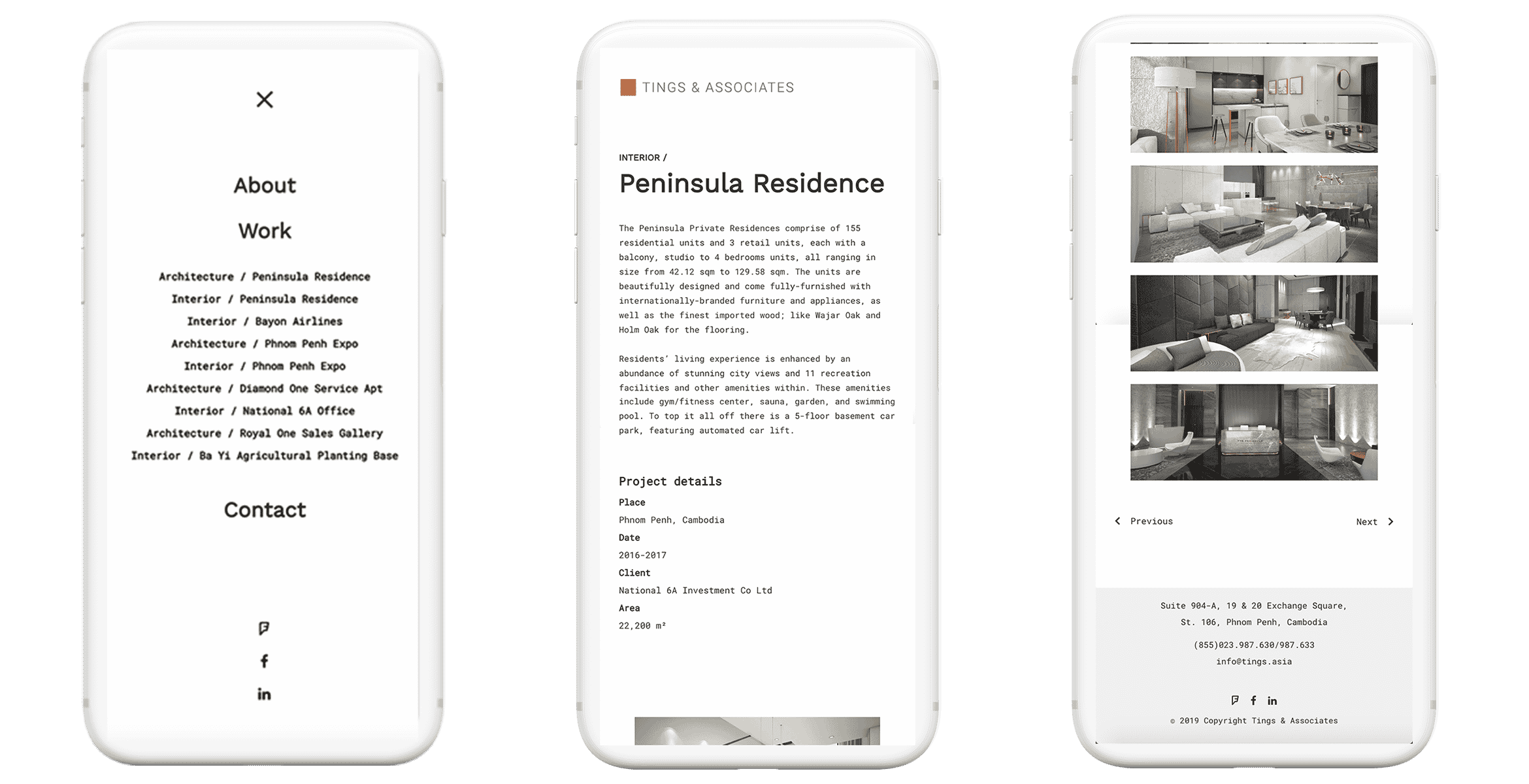
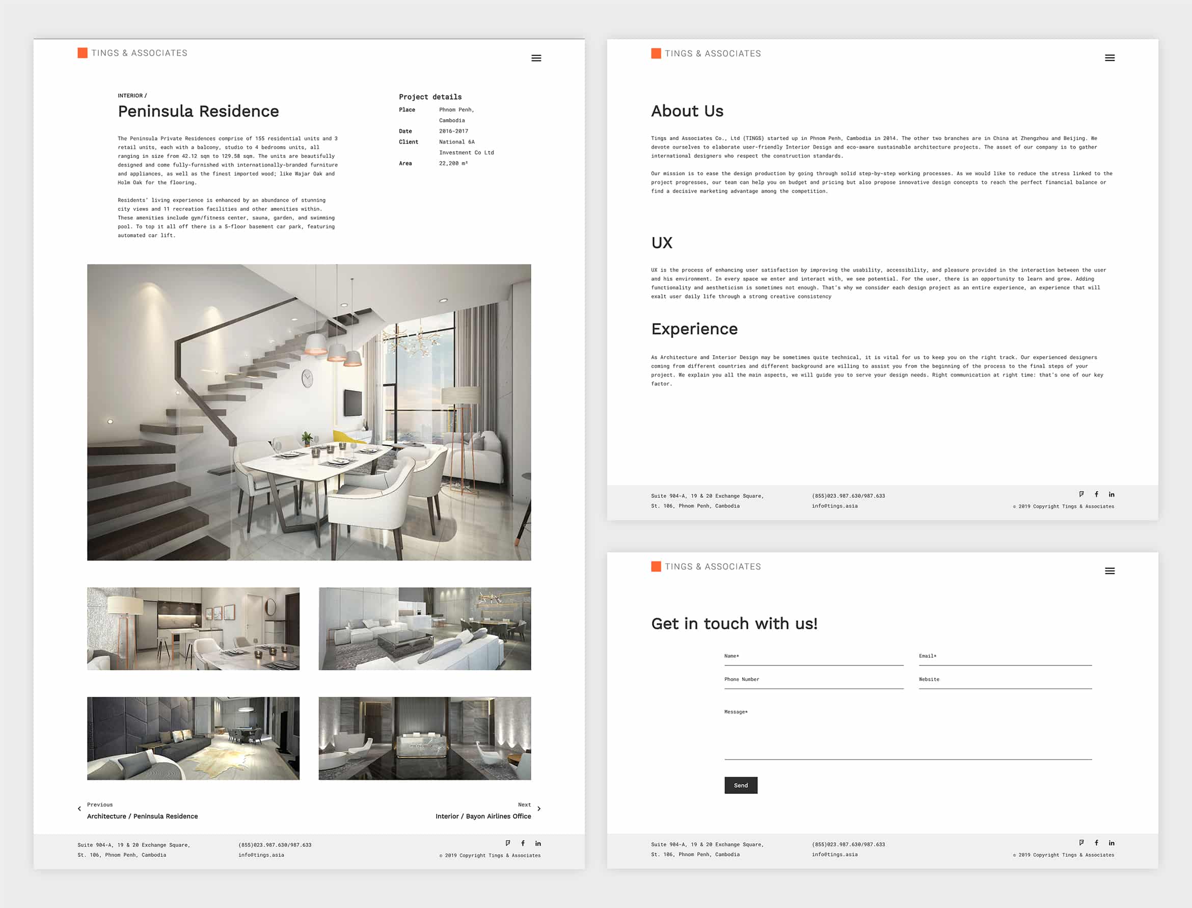
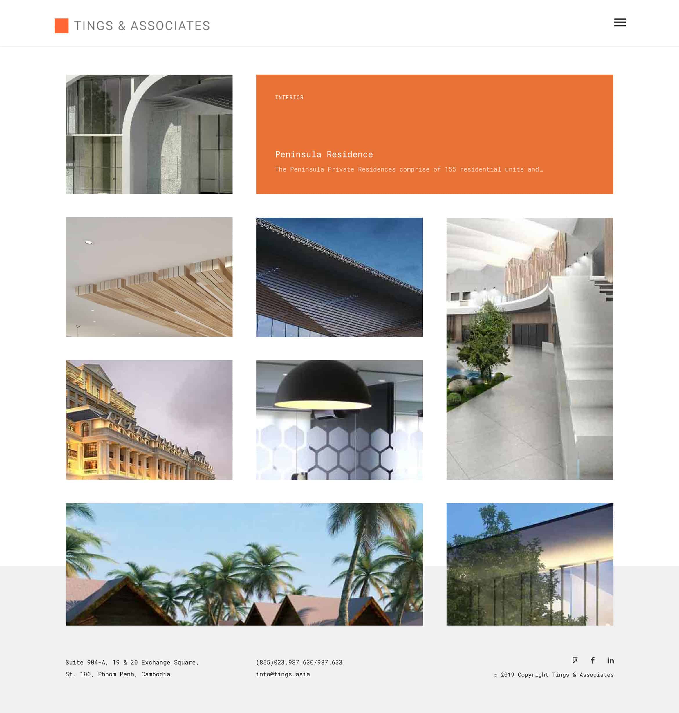
With a cleaner and much more modern, simplistic approach. Tings’ new brand, and digital strategy combines a masonry gridded style with typography that evokes a much more structured process. Their budget was focused more on speed and SEO while the website design was left simple from a User Experience standpoint. Creating a more holistic interior design aesthetic.


