
Presentations often get a bad rap—for good reason. We’ve all sat through those long-winded, mind numbing speeches accompanied by hot mess PowerPoint template designs, that completely defeat the purpose of having a visual presentation.
But what differentiates a good and exciting presentation, from one that is less so?
Well the short answer to that question is assuredly, content and design. While your speech may be well honed in and practiced, the imagery you back it up with can greatly support or confuse your message. No matter if you’re using PowerPoint, Keynote or good old fashioned PDFs, the following tips will help you create eye catching presentations, that effectively get your point across in an easily consumable and memorable way.
1. Less is more.
Nine times out of ten people are coming to an in person presentation, because they actually care about that particular person’s insights on the topic they obviously care so much about.
This is why it is always valuable to keep your slides simple when delivering a presentation to an in-person audience. Of course the slides must be on-topic. But they must also be simple enough that people can still pay attention to what you’re saying. Effectively using the visual presentation to support your message, rather than a visual representation of what you just said. To do this visually follow these simple design tricks…
a) Don’t use more than 6 lines of text.
b) Use single images.
c) Use imagery to stimulate emotional appeal.
d) Use no more than 5 colors
e) Eschew transitions.
2. Visually structure your information more simply.
Now that your visuals are driving more of the conversation in your slides. The next major issue to address is if your information architecture, is solid enough to hold those images with very little copy accompanying them. This can be done with simple, yet deliberate, typographic approaches that will again allow your presentation to be more visual than instructional in it’s approach. Allowing the written information to again fall back into the supporting background of what you’re saying, and not distracting to much from the overall point.
These typographic approaches include…
a) Removing bullet points entirely.
b) Using sans serif fonts.
c) Sizing fonts appropriately.
d) Maintaining a strong contrast between the copy and the image.
e) Use contrasting colors to draw attention in your copy.
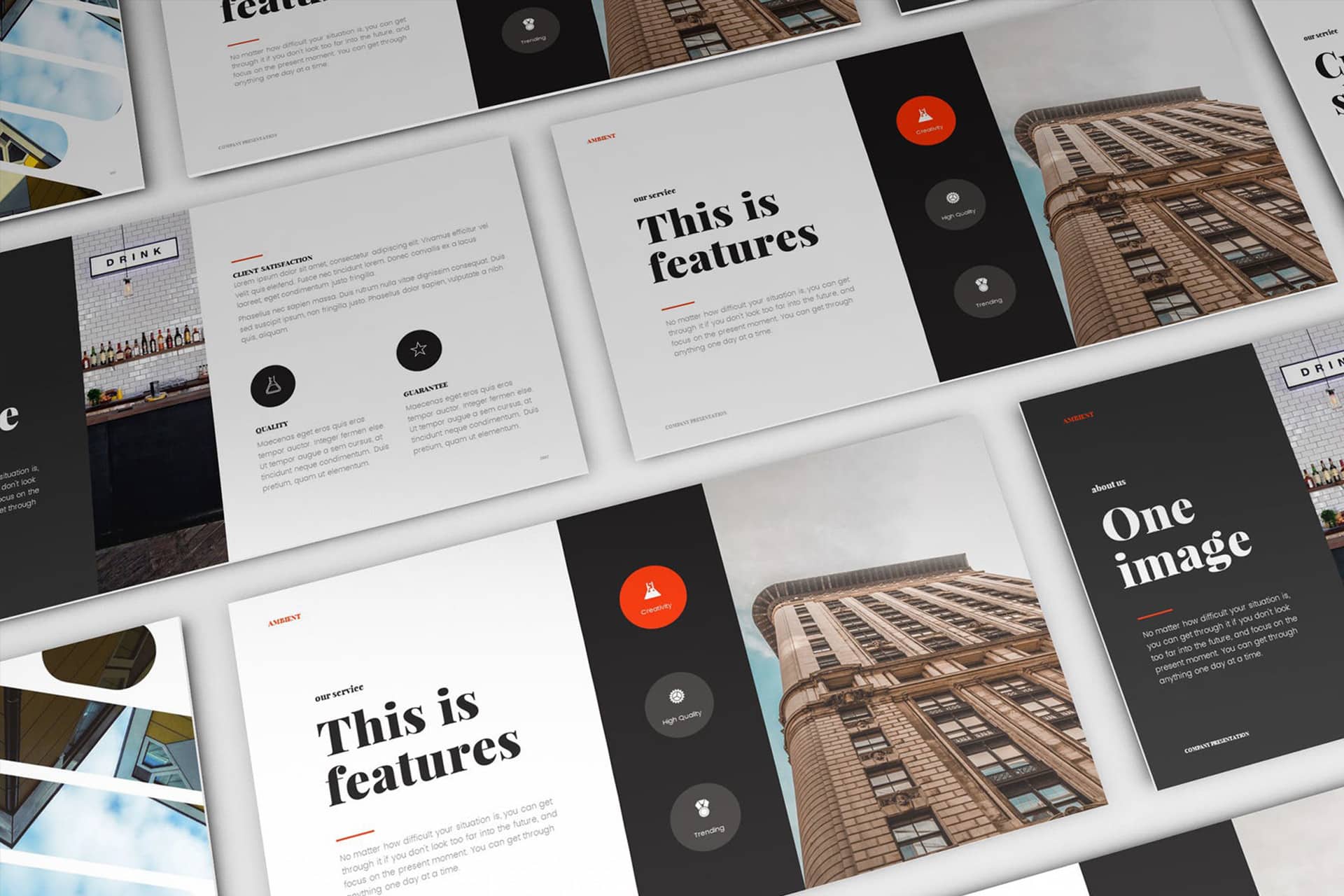
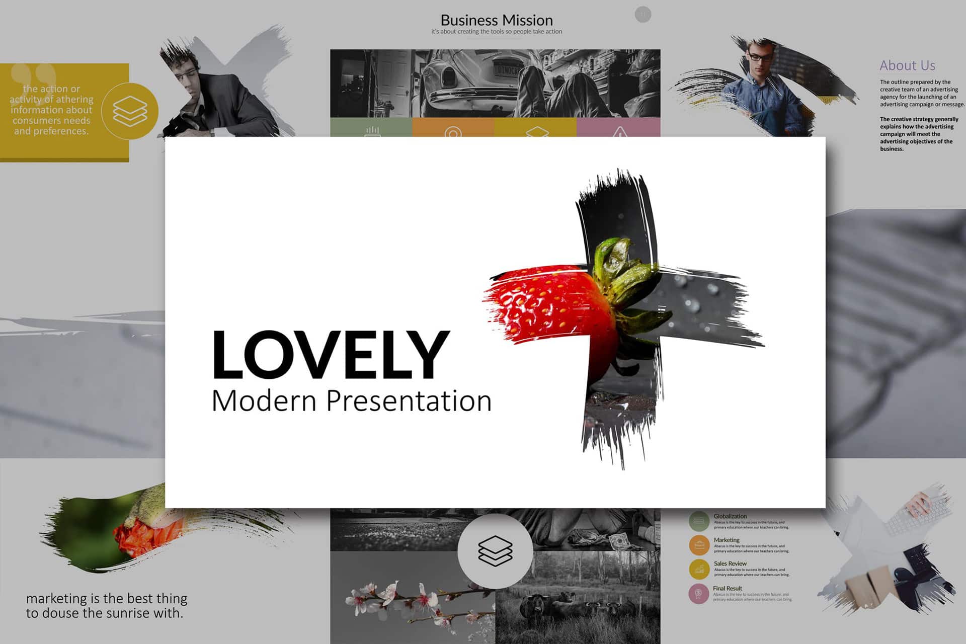
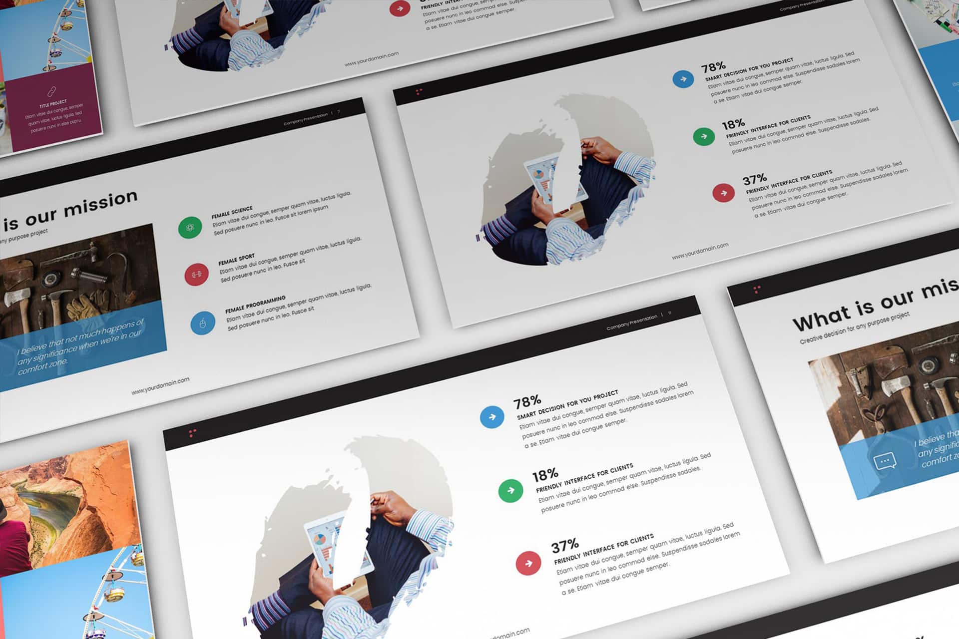
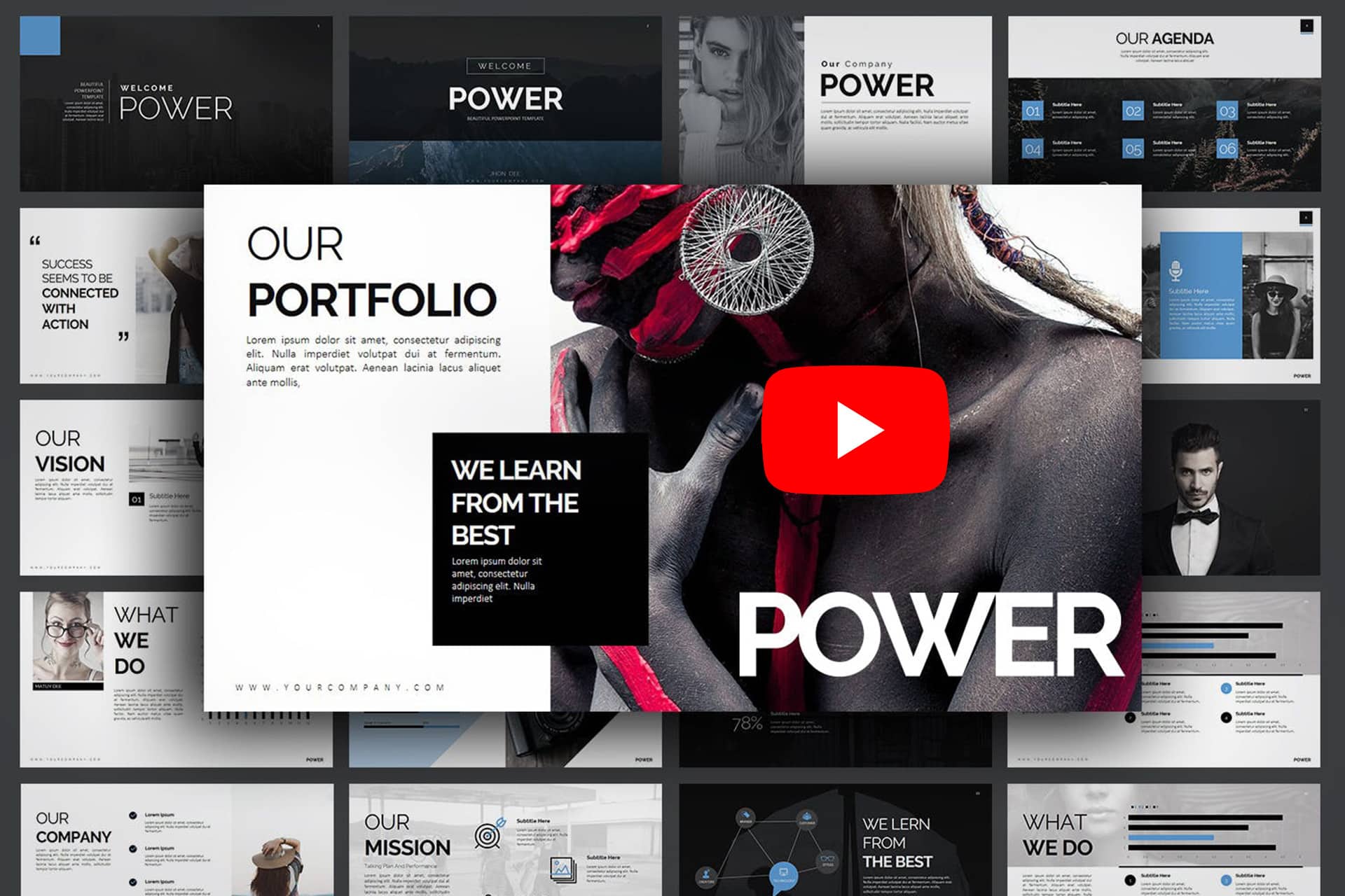
3. Think twice before using templates.
Now don’t get me wrong, using a template to begin a design or even get things moving a little faster while in the process of making your unforgettable presentation can be extremely helpful. Hell– even I in the past have used this approach to get the creative juices flowing. But relying on them entirely is a huge design sin, as well as a presenter’s worst nightmare.
Trying thinking of it from the audience’s point of view. You’re looking for a new and inventive way to achieve your goals, yet every person who presents to you is using the exact same or similar presentation template. Talk about the fastest way to completely lose interest in what the person is saying. So the simplest way to avoid this type of terrifying problem is to do a little research in the way your client is used to being presented to, or has presented in the past. If you can find templates the fit the needs in more interesting manners great! But again tread carefully here, as your approach may not always be as original is you think.
4. Incorporate more multimedia.
It’s always easier to simply tell someone to just believe you because you’re the expert they came to that will solve all the problems they have in your niche field. But the reality is, people love examples that prove your point, and though listing a bunch of client references is very tempting. A video or some audio will always be that much more compelling to any person who is listening.
After all 43% of all people want to see more video or audio content from marketers, often because it helps illustrate and explain theories in practice, in a way that the spoken word or photographs can’t do alone.
For more great examples of how to create better presentations, please give the following examples a read.
